Redesigning an enterprise website
My Role: Strategy • Branding • UX Design • Art direction • Design team management

Foreword
An enterprise website has to cover a wide range of needs and goals.
It has to reflect the right and easy to understand brand messaging. When I think about messaging I think about the story. A story that brings clear value to the user in a remarkable and memorable way.
It has to have the right visual branding, that exactly matches the brand's story and puts your brand on the right spot against your competitors.
From the UX perspective, it has to have an easy to use navigation that connects your users to the content they want to see and to the content you want them to consume.
And last, but not least it has to be an effective lead generation tool, support marketing, sales, SEO and more. All of this we tried to accomplish in this project :)
About the project
Phenom People is an HR tech company that provides a holistic HR solution for companies like Microsoft, Philips, Unilever, Booking.com and more.
It has 16 different AI-powered products that help Phenom People to provide a holistic experience for Candidate, Recruiter, Employee and Management.
In 2019 Phenom unveiled the Talent Experience Management Platform (TXM)
as the holistic approach and platform to connect every interaction throughout the talent lifecycle by delivering personalized experiences for 4 key talent stakeholders: candidates, recruiters, employees, and management.
And we were asked to create a brand new website that will tell the story of the TXM.
My role:
Usually, this kind of project is outsourced to companies that specialize in these kinds of tasks, but due to my background - 10 years of experience as a creative director/art director in leading advertising agencies, I and my team were assigned to this task.
In this project, I needed to deal with many different challenges for the first time in many different fields. I was responsible for:
1. Defining the brand strategy and the messaging
2. Building information architecture
3. Creating wireframes for all of the pages and making sure all of them were telling the story we wanted. Building the right flow
4. Guiding designers to define the visual concept of the website
5. Collect and organise all the content and copywriting
6. Making sure marketing and the CEOs were on the same page
THE PROCESS
Defining a new strategy
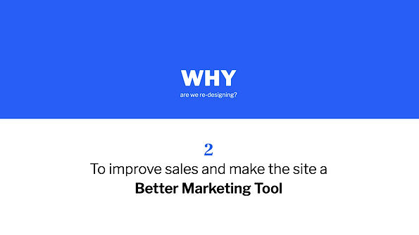
We started to define our strategy by asking simple questions that helped us start building our story.
My first step was to create a Google Slides presentation that would define our strategy and goals for this project.
We asked ourselves some simple questions like:
What is our main goal/focus?
Who is our target audience (Decision-making persona)?
What is our persona looking for?
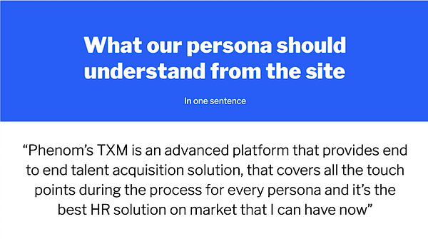
What should our persona understand from the site?
What are our competitors' positioning and branding?
How do we want to position our company in a market among other players?
What is our value proposition?
What are the KPI's?
Here are a couple of examples:

This Google Slides Doc presentation helped us to define and see our project roadmap. This doc also helped us to collaborate easily with other stakeholders and ensure everyone was on the same page.
Research to understand the market and our competitors
We did a deep research on our competitors.
There is a large list of HR Tech companies that has products similar to ours, but nobody handles the whole package. Therefore we also looked into large scale SaaS companies from different areas that provide a wide range of products and services under one umbrella, like Hubspot, Salesforce and etc
Defining our value proposition

Information architecture
One of the most important components of any enterprise website is navigation. The content should be accessible to any user no matter what page he landed on. It should be clear to everyone, yes I know that it sounds very simple but it is super difficult to create it as a matter of fact. Moreover, navigation should serve marketing and product needs, so it should be built in a way it could be expanded in the future when the new pages will be added.
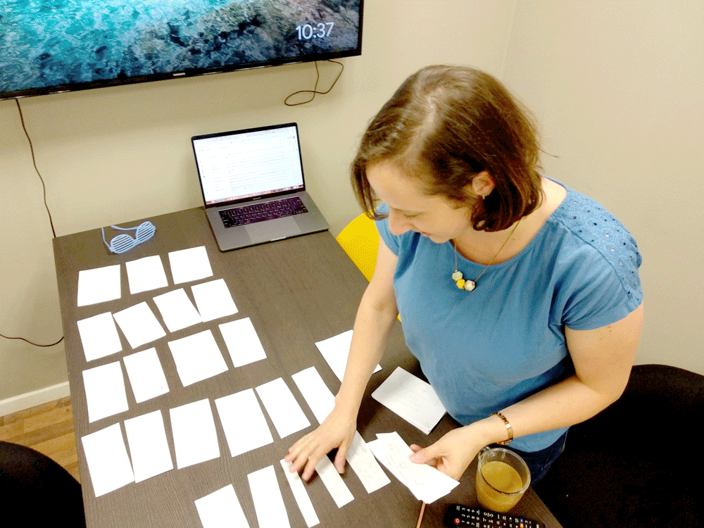
In the picture: Me and Maya Yogev, lead UX/UI Designer in our team, crafting Information architecture, using cards sorting method that represents different pages in the site.

The challenge in building the navigation system:
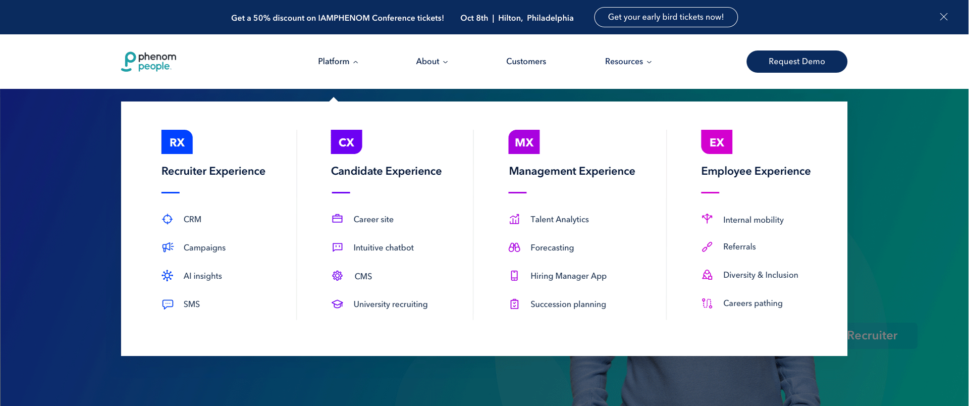
Our new information architecture should provide a user with a simple and clear orientation across four talent experiences: Recruiter experience, Management experience, Employee experience, and Candidate experience that encompass our holistic HR platform - the TXM.
Each of the experiences has a bunch of products inside, that some of the customers might be interested in only in some of them, so they need quick access to them.
In addition, we need to organize marketing content and company information.
So, the main challenge was to order and organize a lot of content under one simple navigation system. First, we created a site map in order to define the information architecture and based on it we designed the navigation system.
Information architecture

Matching the content with the information architecture

Check out how the navigation system looked like at the end of the design process:
UX - Telling the story in wireframes
The challenges:
For the first time, we needed to combine all the content from all different resources in one place and tell a story out of it on the enterprise website.
A lot of work was done in collecting, organizing, sorting and of course, understanding
the content.
We went into each of the 16 different products and understood the value it brings to the market and the users and how it fits the story we wanna tell.
Copywriting and storytelling. None of us is a copywriter but in order to create the right flow and combine all of this enormous amount of content we learned how to become storytellers:) (The next step is to give it for a review and refinement to a kick-ass copywriter)
The whole process was done through close but challenging collaboration with the Marketing team, Product team, and CEOs:)
The process:
The time we were good with content, we started designing the Home page.
First, we started sketching. It allowed us to experiment easily and change stuff quickly. In addition, it created a very friendly collaborative environment, so everyone felt part
of the process.


Then we used Axure to create the rest of the pages based on the ideas and discussions we had in the Sketching part.


Product page wireframe

Experience page wireframe

Design process
Research and preparations
Finally! Once we created enough wireframes and understood the flow of the pages we started the design process.
First of all, we defined the keywords, that would guide our designers and they should keep in mind while designing the site.

In the next step, we made competitive and design research. Created mood boards and collected design references in order to define the direction we wanted to take. The challenge was to make a visual refresh to our existing brand without completely changing it.

Visual Branding and UI Design
First of all, I want to give a big credit and thank a talented UI/UX Designer - Maya Yogev, who worked with me closely on this project and is responsible for most of the design decisions.
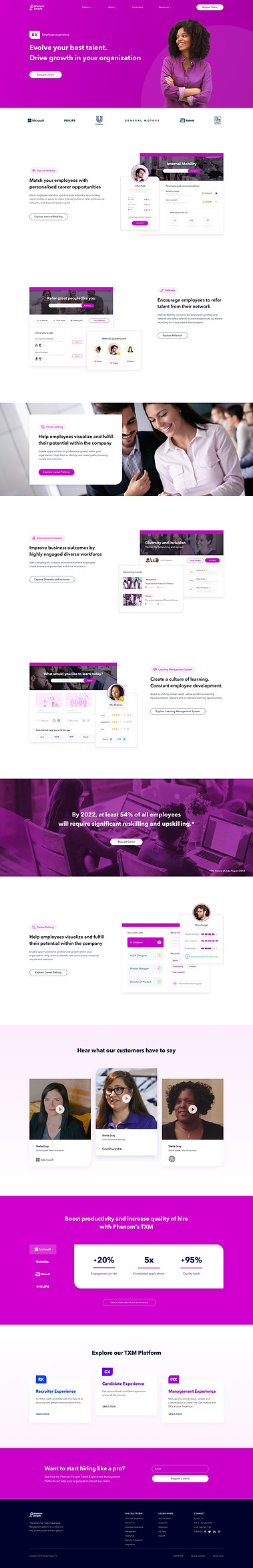
Check out the final design:
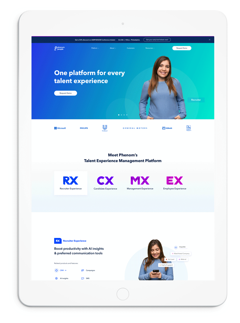
Home page

Employee experience page
Project learnings & takeaways
Cross-team collaboration
In this kind of project, that involves different stakeholders, good collaboration is one of the most important factors towards the success of the project.
Simplicity is strength
As a designer, we are often lured in by attractive, trendy and out of the box designs. But, we must always remember the ‘why’.
The primary goal is to understand the user, their problem and then come up with a design that solves it.
Involve all the stakeholders from the beginning of the project.
Keeping the stakeholders in the loop with an easily shareable doc (we've used Google Slides) as early as possible saves time and re-work.