New layout for monday.com
My Role: Product design lead • UX/UI Design • UX Research • Product management

Bottom line first
Super proud to be the Product Designer who had the privilege to lead, manage, and redesign monday.com layout.
The redesign was part of the long-term vision of moving from monday platform that mainly focused on a project management segment to a multi-product platform and company.
New layout, after the redesign


Old layout, before the redesign
Foreword
Definitely, one of the main monday.com projects for 2022-2023.
In May 2022 we finally launched the Work OS Products and we continued developing new features and capabilities for these products.
As we go forward we understand that the current monday.com layout simply can not hold all of the complexity that comes with the new products. As a result, our main advantage over our competitors - the user experience became less intuitive and more complicated.
monday.com is one of the fast-growing companies in the world, so we needed a layout that can solve the current problems and could also address future needs and requirements
Goals and opportunities
Business goal:
Increase conversion to paying
Activation KPI
UX goal
Create a new layout and navigation system that will address our users' needs baring
in mind our multi-product platform complexity and future business needs
Clear hierarchy · New Information Architecture · Navigation · Updated UI · WorkOs products navigation and clarity
My role:
UX Research:
Identifying problems and opportunities through usability study, generative user research, and competitors analysis
Product design lead:
Creating multiple "Visions" for the new multi-product layout and presenting them to all stakeholders including Roy and Eran (The CEOs) directly that were very involved in the design process
Creating MVP out of visions and testing them in an iterative way with real users
Collaborating:
This project included many of the stakeholders. In addition to our team I needed to share, collaborate, update and get feedback from the CEOs (Roy and Eran), VP of design and the VP of product.
I constantly updated the marketing and sales team. After getting the feedback I kept in the loop with other design and product teams. This change touched every team and domain in the company.
Being Data-driven/aware:
Because the layout redesign included so many changes we understood that it will difficult to measure and understand what caused what. We decided to launch in advance a couple of small tests that were focused on some of the main changes so we can illuminate these data metrics before launching the full MVP
Understanding the problem
UX probelms
The main issues are around the hierarchy and navigation. The layout is not able to host additional levels of hierarchies and content. Users can not understand where they are and what is related to a specific product level and what is the platform/account level

Heirarchy problems

Main and secondary navigation clutter


Product visibility and navigation problem
Responsiveness issues
Data - Conversion to paying
When we investigated our new users' behavior we released that there is a correlation between conversation rate and user first clicks in the platform.
Users who started clicking on main navigation icons within the first 5 min on the platform their conversion rate was 4o% less than users who start creating content: adding items, boards etc
So our hypothesis was that if we redesign the platform in a way that will help users create content faster we will see an increase in conversion.
How: By moving the main navigation from the left side to the top bar. It might reduce the distraction of users from reaching their a-ha moment
It has a high impact on Activation and Conversion

-
Surface clicks within first 15 min correlates with lower CVR rates

-
Clicking on the surface in under ~5 minutes prolongs the time to create content
-
Rate of having content event - time to surface click

After conducting usability research in the current layout and competitors analysis I started working on the new layout and navigation concepts that should better support and address users' needs while they work on our new WorkOs multi-products platform.
Here is a glimpse to some of the directions I've explored:
Exploration - navigation and new layout

After I've tested multiple concepts and explored dozen of directions I've aligned our goals and the design direction with the leadership and other stakeholders to the direction we want to take. (By the way this alignment process took me a while of time and energy, probably one of the most challenging parts of working on the strategic project that involves almost everyone in the company.
Finalising the design
From old layout

To the new one
Defining colors for each of the products
In order to help users differentiate between different installed products and reduce confusion while navigating, each product got its branded color. It impacts the background, primary, secondary, and selected colors.
It took me a while to find the right balance and make sure it is not distracting users from doing the jobs and still making it clear which product the user is on, to prevent them from working on the wrong product.
Also, I worked with our amazing design system team to make sure all the colors works fine in every theme: light, dark, and black

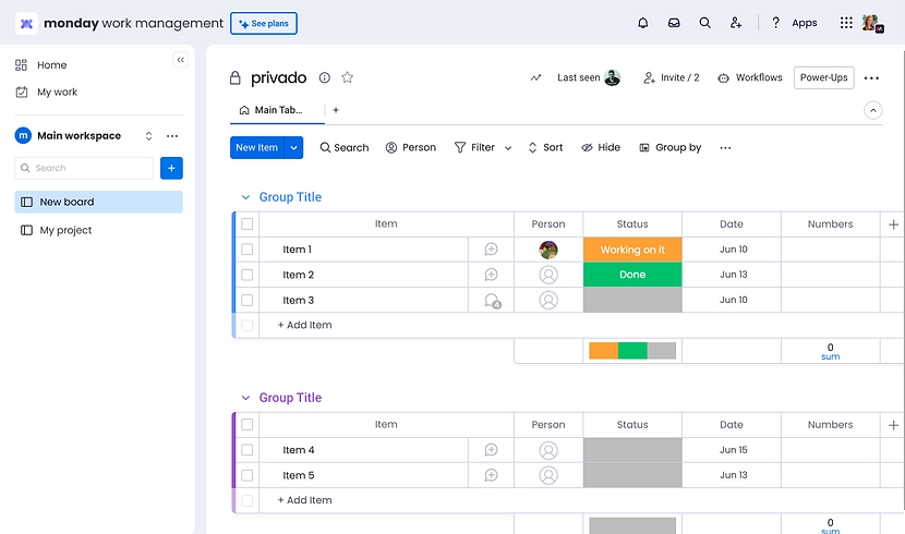
Updating pages design due to the layout change
Due to the layout change, I need to work on many internal monday platform pages and make sure the experience of navigation and getting to content will be easy and intuitive.
Many of the pages were converted to pop up and some of the pages were updated in terms of navigation. It helped users navigate easily and not lose context while performing actions, for example, searching. Also, I removed the dark background which distracted users and had no value. Here are some examples of the pages.

Old :Browse all workspaces" page

New "Browse all workspaces" pop up

Old "Search everything" page
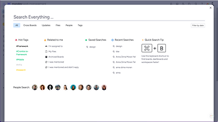
New "Search everything" popup

Old "Admin" page

New "Admin" area
Final Design for the A/B test
Finally! It was a long, intense, challenging but very satisfying project. I had an honor to redesign the billion company (monday.com) layout and make a huge impact for the short term but also for the future of monday. I set up the basis for new development and improvement to come and this the final result


So, how does it look in production?
Impact
The new layout led to a
+35% increase in product installation

a 17.8% increase in product purchases
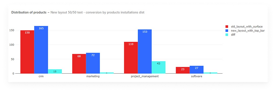
Conversion to paying increased by 0.4%

Next steps in terms of design
After launching the first MVP of the new layout in an A/B test, we knew that we didn't solve all the hierarchy problems. For example, as you can see the "Home page" and "My work", which are both related to the account level (they are cross-products) are still located in the left pane below the specific product, which is not right.
So in order to prepare for the next phases I created for the first time in monday, an information architecture. I mapped all the content, labeled and created a site map to understand the structure and the connections between different areas, so it will be clear to understand where our users go to find content and where they get lost, and what doesn't make sense.
After getting feedback from the design team and testing this with our users (prototype) I created a new information architecture for the next phases to help our users to get their Jobs Done and our designer plan ahead for the next design changes.
This was my last project as a Senior Product Designer at monday. After finishing this project and releasing the new layout to A/B test I was promoted to Product Design Group Lead.


Project learnings & takeaways
Dealing with feedback.
Clean the noise, base your design decisions on data. Define and follow the right KPI's
This project involved many stakeholders including Roy Mann and Eran Zinman. I was bombarded with feedback from many directions because this change effected almost all of the monday.com departments: Sales, Marketing, Brand, Product, PR etc
It was very challenging to move forward because of the way feedback was given and perceived. As a lead designer sometimes I felt confused which made it difficult to make decisions.
What actually helped me is to always remind myself the main goal, check if the solution connects to the KPI's and get back to the conclusion I made from user research and usability testing that supported my design decisions.
Creating multiple options, testing fast, reiterating, test again
The only way that helped me to move forward is to test everything fast. Yes in this case the speed of testing had a large impact on this project. I succeeded to created multiple solutions (prototypes) fast and then I was able to test it with users within 1-2 days and share the results with everyone and move to the next iteration of the design.
I used usertesting.com live sessions and also conduct unmoderated usability testing. Then I shared short videos with the main conclusions and summaries to keep everyone in the loop and moved forward to refining the solutions