Bringing e-commerce experience into Career site
My Role: UX Design • Product Management • Product Design

About the project
If you had an opportunity to search for a job on a career site, you are probably familiar with the not intuitive user experience, uncertainty, and frustration during the process.
This project came out of a need to improve the holistic UX on a career site and to provide the job seeker with a user-friendly job search experience through every touchpoint of the user journey.
My role:
In this project, I needed to combine between Product Management and UX Design. During the process, I did a lot of research, wireframes, MVP's and also some initial UI design which was later picked up and finalized by my awesome design team's members.
The challenge
Business problem:
1. Low KPI. One of the main key parameters for our product success is the number of job seekers who apply or leave their information on the career site. It's both beneficial for our customers and for Phenom People as a HR Tech company.
2. Better user experience leads to better employer brand awareness.
Customers wanted to make a better impact/impression on job seekers and improve their employer brand.
Product/UX problem:
We wanted to create a more intuitive way for people to search for jobs.
We had already achieved the basic needs, but we wanted to improve on the performance and the user excitement - Similar to a Kano model.
For that purpose, we decided to pick up on the best e-commerce UX patterns which could fit our needs and implement them into a career site product.
The solution:
Turning job search to a "Shopping like" experience.
UX Strategy:
I defined a statement for myself and the team so it would be our north star:
To find the right job shouldn't be more complicated than finding the right t-shirt on Asos.
My Goal:
Provide intuitive shopping like experience in our Career sites.
I invested a lot of time understanding the UX patterns in e-commerce platforms, focusing
on search experience and personalization. Some of the main e-commerce inspirations:

Research
Market research (eCommerce platforms)
The first step as always - Research.
It was the most interesting and important part of this project. I was super excited to explore eCommerce patterns that could fit job seeker's needs in the career site. In this case study, I will focus on 3 major parts that we'd improved based on e-commerce patterns: 1. Search 2. Job Description page 3. Application process.
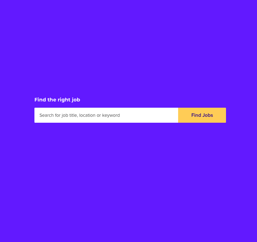
1. Search in eCommerce site - Search in the Career site
Job seekers should have the same search experience as in eCommerce sites.
Smart Autocomplete, Natural language understanding, and other patterns.
The job search experience is the most important for the candidates, therefore we needed to improve it both from a UX perspective and from the data engineering backend side, in order to make it similar to the eCommerce search experience.


In addition to market research, I conducted user research in order to hear and understand user needs and problems during the search process.
Here are some examples:

"The site doesn't have an intuitive search, you type any keyword and you get hundreds of things, it's really frustrating, the more you are able to filter the better."
Chelsea Eaton, Content writer
%20Morris%20.png)
"You put in "Manager" and you get all these garbage results that don't mean the same thing. You are searching for a full-time position and you got also a "Contractor" and I don't want a contract job. It's really frustrating.
Kristina Morris, Project Manager
2. Product Page - Job Description Page
The product pages include interesting and effective patterns to convince the user to buy, such as: Reviews, Social proof, Urgency and etc. The same patterns could work also for the Job description page, right?


What job seekers are saying about the Job Description page:

"I want to understand from a Job description if I fit this job and if not what is missing in order to get this job. The job description is not the real description of the job, they are far more demanding. The job description has too many buzzwords. It looks that companies are looking for someone super professional for a basic job. In the end, the employee feels overqualified and wants to leave.
Max Levit, Project Manager, Toronto, Canada
3 Check out - Job Application process
Checkout flow is super important. Ecommerce platforms invest a lot in the checkout process from the user experience perspective. They do tons of usability testing, A/B testing, and backup their decisions by data...and there is an opportunity for us to explore these patterns and solutions in order to learn from them and to implement them into the Job application flow.


What job seekers are saying about the application process:
Why should I type all the information that the company already has in the resume that I have just uploaded at the beginning of the application process? Some of the questions don't even matter for this role... and if you are making it so difficult for me to even join when all I want to do is see there I am a good fit, clearly, I don't want to work there.
How difficult everything else will be when I can't even easily apply for the job.
Kristina Morris, Project Manager
Design Process
1. Designing the search behavior
There were two challenges.
The first was to create a user-friendly search that would work for every client. It would need to support natural language understanding and to have smart and intuitive auto-complete suggestions. The second was to work with the Dev team and make it happen!
A side note:
Every time you see a simple and intuitive user experience, be sure there was a lot of work done behind the scenes....and this was the case here too.
The main challenge was to understand the logic and to define all intents and their meaning. How they should appear and in which order. To understand this, I had to design over a dozen wireframes and to check all possibilities to align everything with the Search Dev Team.

UI solutions:
1. Use labels to categorize the autocomplete result

2. Use icons on the left for each of the results. Later we realised that users didn't understand some of the icons, so we got rid of this solution.

3. Provide a label hint on the right side of the relevant result. This solution won but we are still checking and refining it.

4. Different Search solutions were checked
2. Designing the Job description
The job description page is one of the most important pages on the Career Site. Probably the most important one. The majority of the users land directly on this page, therefore it should provide first of all a clear understanding of what is the job about and how the user fits this role. On the other hand it should provide some information about the company to create the best first impression it can, so the applicant could have some emotional connection with the brand to help him/her to apply for the job.
Key elements in the Job Description page: Fit score & Smart tags
Fit Score: This feature will help the users to understand their fit to every job on a career site, based on the users' profile.
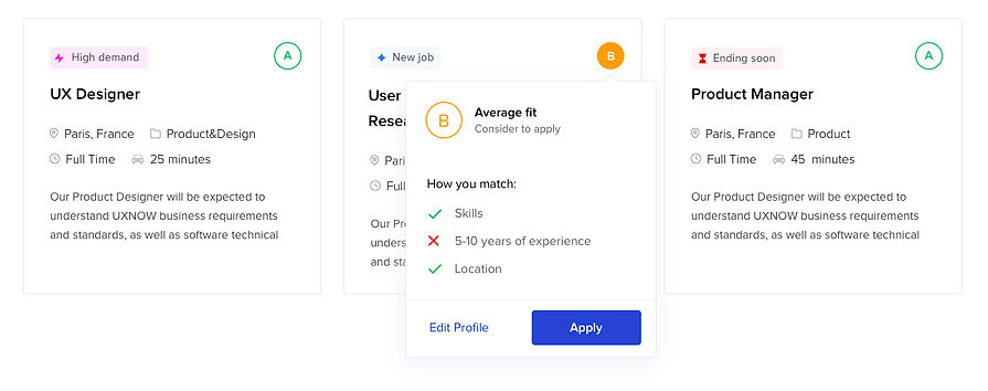
Smart Tags: We created smart tags to increase the discoverability and help/encourage
the job seeker to make a decision. These tags use Urgency/Scarcity method which is similar
to e-commerce patterns that you're probably familiar with, such as: "Hot deal",
"Only 2 rooms left", "23 people looking at this room" and etc.


Job cards design
UX design: Kogan Dima • UI Design: Maya Yogev
Job Description page design

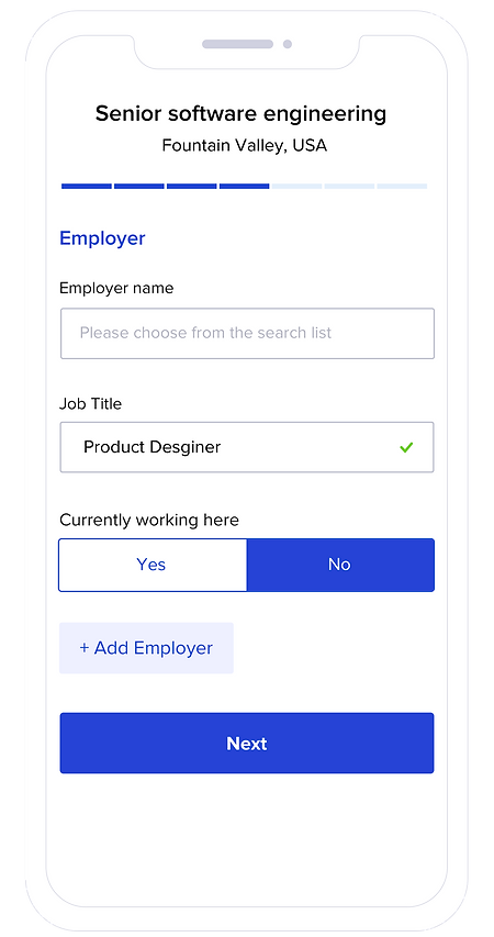
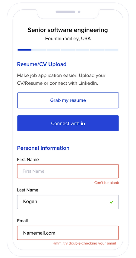
3. Job application flow - Redesign
Our goal in this project was to make the application process easy and intuitive for candidates and as a result of that to decrease the drop off rate and to increase user satisfaction.
There were a couple of challenges that we encountered, such as the number of questions/fields that each client wants to have within the application process. The order and number of steps and etc. We tried to break the application process into steps that would be easy to complete and would fit almost every client.
The main inspiration as I mentioned before was the "Checkout" process from eCommerce platforms.
Before we started the design, we first analysed all the research we did and created our hypothesizes and conclusions based on the User research, Competitive/Market research, Data Analytics, and of course understanding our client's needs.
Job Application Design
Web screens


Job Application Design
Mobile screens
Other e-commerce patterns
Lead Gen widgets
The main KPI we can measure to give us an idea about the success of the career site - is the number of leads/completed applications.
Therefore we created a bunch of Lead Gen widgets that help us to increase the KPI and in the same way to provide the user with value.
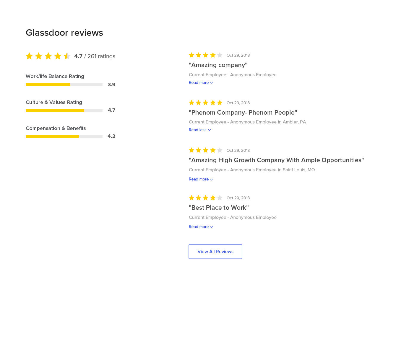
Reviews and Social proof
"Social proof" is an effective way to create trust, improve brand awareness and engage users towards call to action. Therefore when we redesigned our Glassdoor Reviews widget we created it based on the Reviews look & feel on the e-commerce platforms.
Using Urgency/Scarcity method in Job Cards
Probably you're familiar with all of these examples from e-commerce platforms: "For a limited time only", "Only 3 left in stock", "15 watching this room right now", Booked 20 times today, "Great value today" and etc. This is a proven and effective method for increasing desirability.
Based on our AI tools we were able to show the relevant and valuable "urgency tags" on specific job cards.
* In order to do this right, you had to follow ethics rules and be credible.

Project learnings & takeaways
Strategy and research
There are a lot of cool features out there and it's tempting to Copy & Paste it to your project. But the magic happens when you succeed in finding the exact fit for your project. It means that you will need to change and adapt some of the conventions, especially for your needs (User or Company needs).
Cross-team collaboration
I think that this is one of the most important factors in project success specifically in company growth in general. Without involving other teams into the process you can not expect to achieve any success. Specifically in this project, our "Machine learning team" was the key factor and without good collaboration with them, this project would not have happened.
Product optimization
Once you've launched it, you should follow the data. It's very easy to abandon the project after it has been released. There is no time to celebrate (ok maybe on the day it was released). Now it's time to improve, adjust and maybe remove some of the parts of the project, based on the data. Ask for the DATA!!!