Redesigning monday.com
workspaces navigation
My Role: Product design • UX Design • User research • Product management

Foreword
It was one of my first projects at monday.com. When I arrived at monday.com the team just released new navigation to some percentage of users.
As a new joiner, I could take a fresh look at this release. I reviewed it against usability heuristics and design guidelines principles and it was clear to me that this new navigation solution didn't address user needs, especially the enterprise accounts.
But here is a thing. Everyone was so excited about this release that it was really challenging to raise a hand and focus everyone on the usability problems and drive to change it
About the project
Left pane navigation helps users to navigate between different workspaces, boards, dashboards, and docs in the account. The higher hierarchy is a workspace itself that might include different instances like boards, dashboards, and docs.
After doing usability testing and getting more and more concerns/tickets from enterprise clients we decided to stop the release and redesign the navigation that was just released. Not an easy decision for the team
My role:
In this project except for leading the design, I needed to raise the awareness of the team to the usability issues and drive the team to make the change.
What I actually did:
1. Followed the numbers and the customer feedback
2. I conducted user research and usability testing and shared it with the team
3. Created the solution - UX/UI design
4. Tested it with users
5. Followed the numbers and customer feedback after the new release to make sure we are in the right direction
The problem:
1. Core Usability issues - Orientation and navigation. Accessibility
2. "Scaling" problems - not useful for enterprise clients with a large number of workspaces
-
Users can't understand the name of the workspace
-
Impossible to search and find workspaces
-
3 levels of navigation are too complicated and not user-friendly. Users need to click in many places in order to collapse/expand the navigation
-
The hierarchy between the different levels of navigation wasn't clear and confusing
-
Usability and accessibility issues - difficult to hit the targets
-
No clear indication of what workspace the user is at
-
By navigating to a different workspace, the board that was shown was still from the previous workspace which created confusion
and many more...
A quick glimpse on monday.com navigation before I started working on it

3 levels of complex and confusing navigation. Colorful avatars represent workspaces that nobody can actually read and understand.

The solution
First of all, I looked at the data. Most of our clients (approximately 85%) have 1-3 workspaces. But enterprise clients that become our main business focus as we began to scale could have about 8 workspaces on average.
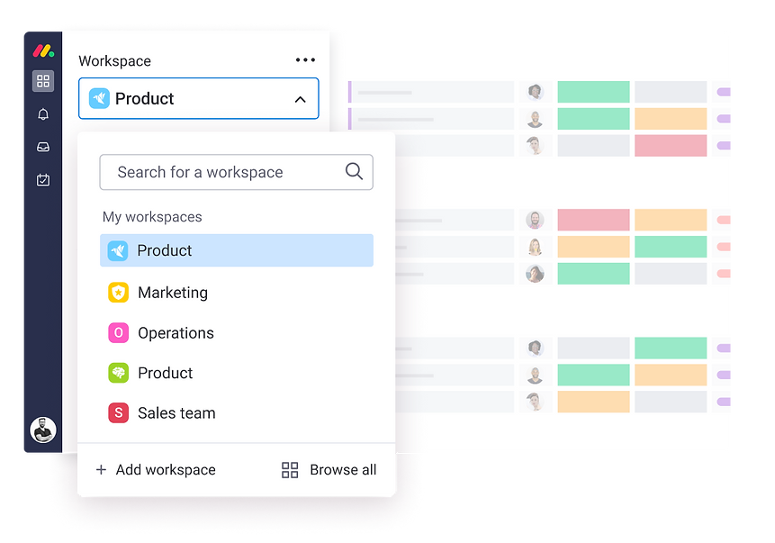
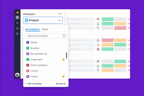
We created a drop-down menu to replace the workspace icon menu. The menu enables users to quickly navigate to their workspaces, search & browse additional workspace in your account and access your favorite boards and dashboards.
Most importantly users now can clearly see the names of the workspaces and understand what workspace they are on and what they can search for if needed. Users can instantly identify the relevant Workspace by both their icon and their name, making it super easy to move around between workspaces.
It helps to keep our customer's accounts organized and uncluttered as they grow with monday.com
Workspace drop-down navigation design
How it actually looks in production
Next steps
The next step is to help users get faster to their most-used workspaces.
We can consider a couple of solutions, starting from presenting recently visited workspaces at the top or even providing a capability to star the most used workspaces.
In addition, users will be able to adjust the tab navigation by changing the position of the tabs. Let me know what you think about it:)
Project learnings & takeaways
Provide your honest and professional feedback even though it might be not the best timing for others to hear it. Say what you think, no matter what.
When I arrived to Monday, everyone was celebrating the new release of the new workspace navigation. I knew that this navigation won't succeed because of so many usabilities issues and a lack of product and UX fit for our customers' needs. But I wasn't afraid of speaking up and eventually, I succeeded to convince the team that we should stop the release and redesign the workspace navigation from scratch.
Don't forget to test and validate your solution also in the edge case scenarios
Edge cases are the most interesting ones. I always look into them when looking for a solution to a problem
As we can learn from this project the team who released the initial workspace navigation didn't take into account that some of the customers might have 10-20 workspaces. In this case, they need to have the ability to search or at least scan the list of all workspace in order to navigate. Avatars with initials or icons will not be able to solve this edge case.
A/B test is not usability testing. Validate your solution with users before writing a single line of code
While working on MVPs and going live to A/B tests, it's very tempting not to validate the solutions with users and to rely mostly on intuition, knowledge, and previous expereince.
We are thinking to ourselves: "It is a small increment, it's an MVP, it's a test, we are working in a low-risk methodology. If it fails we can change or fix the test etc...BUT quant data doesn't provide us with the full picture and we can not know just by looking at the numbers if the feature is successful, especially from the user experience standpoint.
And if the test wins you can release a feature with really bad UX as happened to my team. So I tend to validate with users every design that goes to production, even if it is a small change for the A/B test.
Share your usability test findings with all stakeholders and teammates
Everyone has an opinion. Everyone is smart (especially in a companies like monday.com:). In order to make a pivot in a product solution sometimes you need to prove your point and have a piece of very good evidence.
What I have found as a very effective method is to share usability test insights with the team and discuss them together in an open-minded conversation. So everyone will be a part of discussing the problem and being aligned to it and also everyone can bring ideas on how to solve it.
In this case, everyone is onboard and it is much easier to move forward wit the change
Keeping the team members in the loop of the problem also create a better work environment