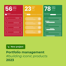
Work OS products
My Role: Product design lead • UX/UI Design • UX Research • Product management
Illustration by amazing: Pierre Kleinhouse

Foreword
Definitely, the main monday.com project for 2022.
In May 2022 we finally launched the Work OS Products.
By achieving this amazing milestone, monday.com made a major pivot from a mainly known project management tool to a Work OS platform with end-to-end products built on top of it to completely address the needs of specific use cases for Marketing, Dev, Projects, Sales &CRM teams.
As the Lead product designer of this project, I was responsible for creating a layout and the design infrastructure that will enable to host work Os products on the platform. My main goal was to enable users to find, explore, install and use Work OS products in an easy, meaningful, and intuitive way.
During the year I created multiple visions, did dozen of user interviews and usability tests, and worked closely with different stakeholders including Roy and Eran the CEOs of the company directly.
In addition to that, I also took a part in the rebranding effort and helped the branding team and marketing designers to craft and deliver the right visual and branding message for the Work OS multi-product platform.
Goals and opportunities
Business goal:
Convert from a Project management tool to a Work OS multi-product platform.
Launch new products and a new pricing model that will better compete in each cluster
Rebranding and repositioning
New layout, structure, and branding to support Work OS multi-product platform
Redesign the monday.com structure from a single project management tool
to Work Os multi-products platform
Exploration and navigation
Enable users easily to explore, install, understand the value, and use the different
work OS products in one platform
The challenge:
Until 2022, monday.com was mainly known as a project management tool that can fit every client size and solve any use case, but there was no clear differentiation within the platform between different use cases that the platform could solve.
For us, it was a great opportunity to package the platform in a new way so it will provide the clients with clear and well-defined end-to-end products that could be installed on top of monday Work OS.
Each of the products solves any use case in that specific vertical: CRM, Marketing, Dev, Projects, powered by relevant integrations, apps, templates, and more.
My task was to create a new layout and navigation that will support this new work OS multi-product concept.
My role:
UX Research: Identifying problems and opportunities through generative user research
Product design lead: Creating multiple "Visions" for the new multi-product work OS platform concept and presenting it to all stakeholders including Roy and Eran directly.
Creating MVP out of visions and testing them in an iterative way with real users via Usertesting.com
Working on the new brand for each of the products with our brand and, marketing team
Collaborating: Creating user research summaries and sharing the findings with all the stakeholders
Working closely with the product, dev, and analytics team to launch our tests, towards the final solution we want to launch in May 2022
Being Data-driven/aware: Following the test KPIs and other metrics to adapt the solution based on it
Understanding the problems and testing
the solutions

During this project, I conducted dozens of user interviews and usability testing in order to make sure we are moving forward in the right direction and addressing not only our business goals but also our users' needs, pains, and problems.
It helped me to move forward fast and effectively and also allowed me to make sure that all of the stakeholders were on the same page regarding our problems and solutions altogether.
Shout-out to the user testing.com platform that made it possible for me.
Here is me and monday.com dear users, discussing and testing our Work OS Products solutions.
Yalla, let's go through some of the design stuff
WorkOS product logos
In addition to leading the product design, I was also part of the team who worked on the branding of the work OS products.

Final product logos that came out of the process. Love it or not I designed the Sales CRM logo:) The rest of the logos were crafted by a talented Roni Levit

I've created and tested multiple navigation solutions to help users find, explore, install, and navigate between different products in an easy and intuitive way keeping in mind our main KPI's
Navigation
Here are some concepts I designed that were tested
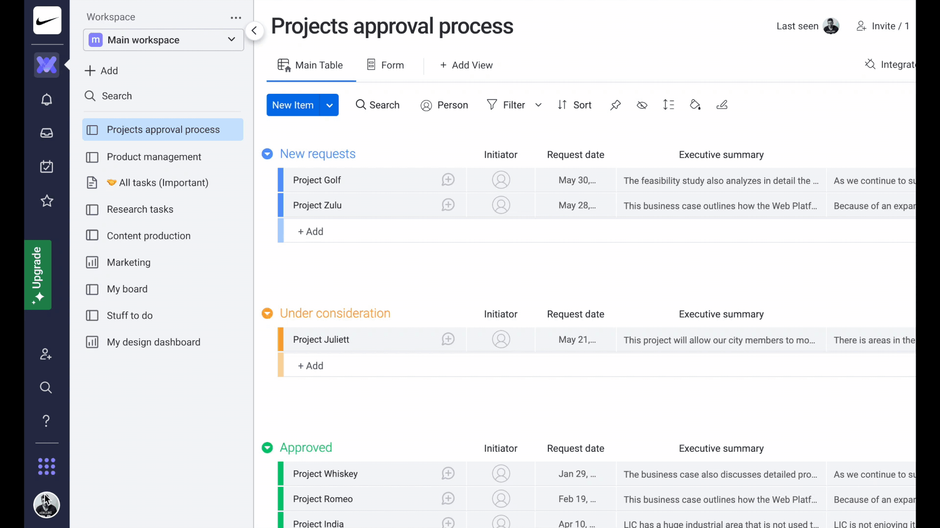
Now we are A/B testing these 2 solutions. Baring in mind our business goal and the activation metrics
New design

Control

Final decision was to combine the 2 options above

It's important to say that the current navigation (The switcher at the bottom) and layout are just the first and the initial steps toward our vision. This is how we work at monday.com, moving forward step by step and testing everything, so we can make decisions based on the quant and qual data in order to provide our users will the best experience we can.
In the last months, I was working on the new layout and navigation concepts that should better support and address users' needs while they working on our new WorkOs multi-products platform.
Here is a glimpse to some of the directions:
Navigation and new layout exploration

Product store
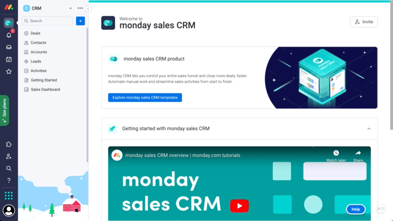
I designed a new product store, where users can find, explore and install new products based on their needs. As with any new feature, I created multiple concepts based on previously made user interviews and competitor analysis then I tested the prototypes (MVPs) with monday and non - monday users to make sure we meet their expectations, address their needs and ease of use.
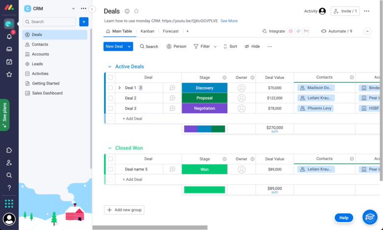
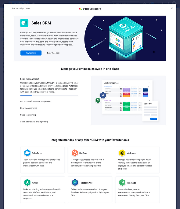
Product store design. Users can explore all work OS products and see what products were installed and what were not. By clicking on the cards user were redirected to the Product overview page which is presented below

Product overview page design. Each product has its own page that helps users to understand the value of the product and decide if it fits their workflows and needs.
Template center
A new template center was born. Users can explore templates based on the products they installed in addition to the platform templates (work management templates)

Product overview page
Each product got its dedicated product overview page to learn more about the product and help users reach the AHA moment as fast as possible. This page contained a link to the templates to start with and learning materials. During the process and several tests we conducted we decided that this page didn't succeed to provide enough value based on the KPI's we set up so we didn't put this page in a very prominent and discoverable area, but it still there and we will try to improve it based on the data we already have
Next steps
After launching the Work Os products MVP, we understood that we have friction around monday work management product - the value of it isn't clear, and how it differentiates from the "monday projects" product. Also, users are confused about why they are getting this product by default in addition to the other product (this problem is related to our pricing packaging model).
The next phase of this objective will be to better define what is the platform layer and what is the product layer and to make it clear both from the UX perspective and the pricing model.
We also understood that the current layout which was based on the previous one - doesn't support scale (additional hierarchies, new product features etc), and had several hierarchy issues which we identified through usability testing.
Also users get lost in the main navigation on the left, which doesn't provide much value for new users
The next steps are:
-
Make it clear to users what is the platform layer and what is the product layer.
-
Make product differentiation and value clear to users
-
Solve hierarchy issues, so users will feel confident about where they are and what they should do next.
The new layout should support each product value and help users find, navigate and use the product in an easy and intuitive way (based on their mental models. Users already expect the certain product to behave in a certain way based on their previous experiences)
Project learnings & takeaways
Dealing with feedback.
Clean the noise, base your design decisions on data. Define and follow the right KPI's
This project involved many stakeholders including Roy Mann and Eran Zinman. I was bombarded with feedback from many directions because this change effected almost all of the monday.com departments: Sales, Marketing, Brand, Product, PR etc
It was very challenging to move forward because of the way feedback was given and perceived. As a lead designer sometimes I felt confused which made it difficult to make decisions.
What actually helped me is to always remind myself the main goal, check if the solution connects to the KPI's and get back to the conclusion I made from user research and usability testing that supported my design decisions.
Creating multiple options, testing fast, reiterating, test again
The only way that helped me to move forward is to test everything fast. Yes in this case the speed of testing had a large impact on this project. I succeeded to created multiple solutions (prototypes) fast and then I was able to test it with users within 1-2 days and share the results with everyone and move to the next iteration of the design.
I used usertesting.com live sessions and also conduct unmoderated usability testing. Then I shared short videos with the main conclusions and summaries to keep everyone in the loop and moved forward to refining the solutions